Optimum Levels for Longevity and Well-Being: J Curves
The J Curve
Today, I would like to share something called “optimal.” We often think of things on a linear scale, but biology is rarely linear. There is a possibility of having too little, and too much. Therefore, there must be some optimal amount. It turns out that there is a ‘J’ curve for almost everything. The very bottom of the ‘J’ on a graph is the optimum level. I am going to use the ‘J’ curves for “ALL-CAUSE MORTALITY” because it is the least likely to be manipulated. If someone has some “heart disease” endpoint, there is a lot of play in the diagnosis, whereas when someone is dead… well, there’s no faking that!
I am choosing what may seem like random graphs to illustrate certain points about what is optimal.
Hemoglobin A1C
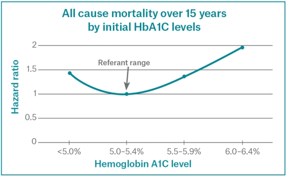
This illustrates nicely what a ‘J’ curve looks like. The odds of dying increase on both sides of an optimum level. A study of over 11,000 people who did not have diabetes was assessed for their risks of dying from any cause.[1] It is very interesting to see that blood glucose (sugar) can be too low! Those with HbA1c at 5.0 or less have an increased risk of death. The best range of HbA1c is between 5.0 and 5.4. Those who have pre-diabetes (HbA1c 6.0-6.4) have twice the rate of death as those who have the optimum level – the bottom of the ‘J’ curve.
Thus, though doctors are told that lower is better, and that pre-diabetes does not need to be treated, clearly there is an optimal level that makes a difference in lives.
Vitamin D
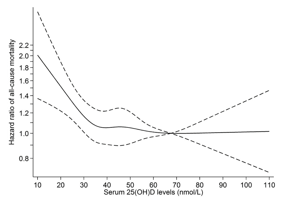
Even vitamins can have a ‘J’ curve. We can get too much. Too much of anything can be toxic. However, Vitamin D is a good case to illustrate the effects of the “95% confidence interval” or 95% CI. What that means is instead of just looking at the average, we look at where 95% of the people fall. Thus, in this graph you see a line, the average, with a dotted line on either side, which is the 95% CI. Notice that there is an ideal level where the average meets the “1.0” line, or the average rate of death. Then, the average stays at “1.0” while the 95% CI starts getting really wide as the level of vitamin D goes up over 70. That means that people are dying of other causes, and just happen to have high vitamin D. They are just as likely to live longer as to live shorter with high vitamin D levels. The clear optimum blood level of vitamin D is 70 nanomoles per liter, which corresponds to 30 nanograms per milliliter. (Different labs use different measurements).[2]
The take-home message is that Vitamin D does not get toxic at high levels, and is not associated with a risk of death, despite what doctors are told.
Cholesterol
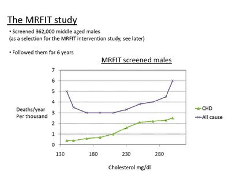
There is an optimum amount of cholesterol.[3] Every study that looks at “All-Cause Mortality” shows that too little is worse than too much. So why do the doctors always tell us that it is best to be below 200? It is because those who do marketing for cholesterol medications narrowly focus only on “Cardiovascular” issues. Here is a graph from the famous MRFIT study[4] of over 350,000 men starting in 1980.
Notice how the “ALL CAUSE” mortality has a ‘J’ curve, with lower cholesterol being associated with higher death rates. However, the “CARDIOVASCULAR” mortality keeps going down. So, the drug companies taught the doctors not to look at “All-cause Mortality,” just focus on heart disease.
For “All-Cause Mortality,“ the cause of death is not distinguished; it may be from COVID, or an automobile accident. So, how is that related to cholesterol levels? We don’t know. We do know that low cholesterol is related to cognitive decline, since cholesterol is needed for the function of all nerves, especially in the brain, as well as immune function. Every cell requires cholesterol to function. So, whatever the reason, even though people die less from cardiovascular disease, there is consistent and compelling evidence that those with a cholesterol level between 200 and 250 are less likely to die in a given time, than those who are below 200, the ideal chosen by cardiologists.
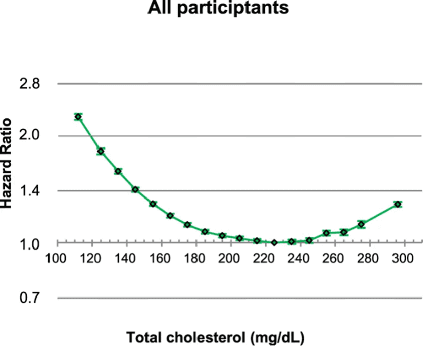
The largest study ever done includes 12.8 million adults (that’s over 12 million more than the previous study, and included young adults and women) and showed that men or women in every age group have an optimal level of cholesterol around 230.
On the right, “Hazard Ratio,” 1.0 means one time the average, or normal, death rate. 2.0 is twice the average death rate, and so on. Looking at this graph, you can see that the 95% CI is very small, that means the association is strong, or the level of cholesterol is likely related to the cause of death. It becomes obvious that the optimal level of cholesterol is around 230. A cholesterol level of 120 has twice the risk of death as someone with a cholesterol of 220!
Body Mass Index (BMI)
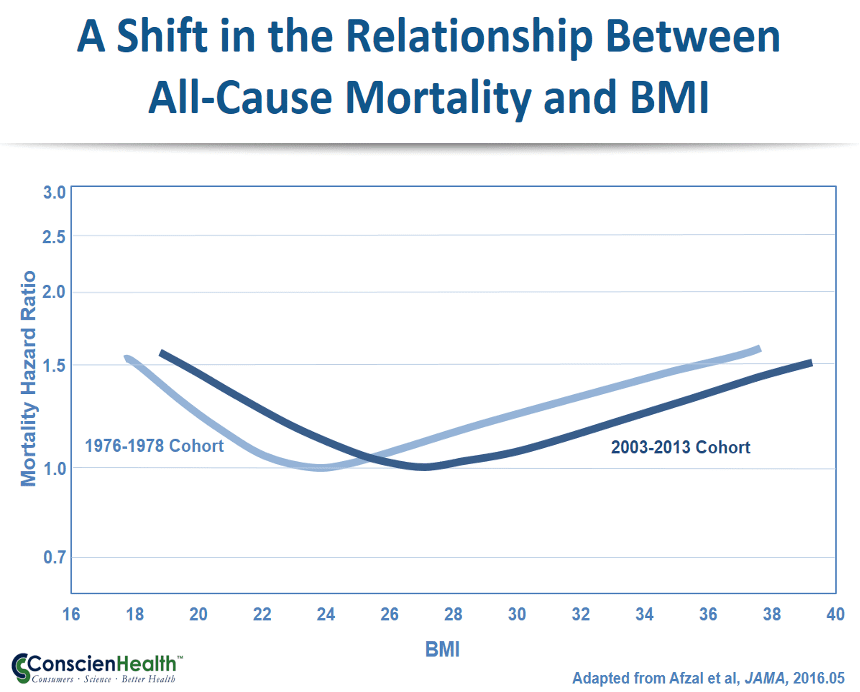
Body mass index uses a weight to height ratio. The optimal has always thought to be what is “normal.” However, normal has changed.[5]
We are told that BMI should be between 20 and 24. However, the most current studies indicate a different story. It seems in modern society that 27 has the lowest mortality. That is considered overweight. In fact, according to the graph, a person who is obese with a BMI over 30 is at a lower risk of death than a person with a BMI of 20, which was previously considered optimal. The old saying, “You can’t be too rich or too thin” is not true (in either case!).
Protein
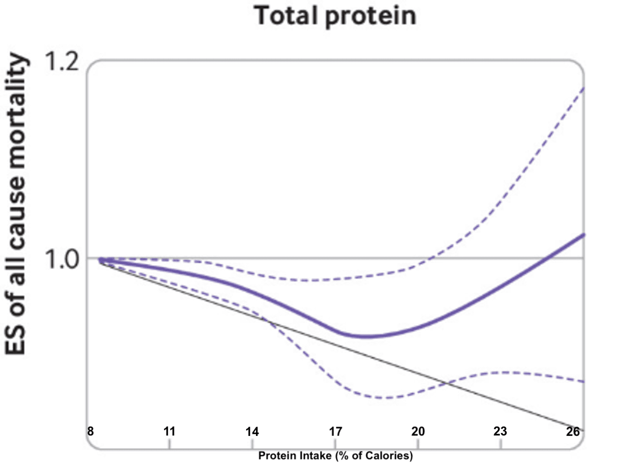
We have been told that there is an association between protein intake and health. Because the graph of mortality to protein intake is complex, people have interpreted portions of it to indicate that more is better, or less is better.
It seems clear that adequate protein intake lowers the risk of death, up to a point. But notice that the 95% CI gets wider and wider as protein is increased. The optimum amount of protein intake seems to be about 18% of calories. More than 25% of Calories may increase risk of death.
Blood Pressure
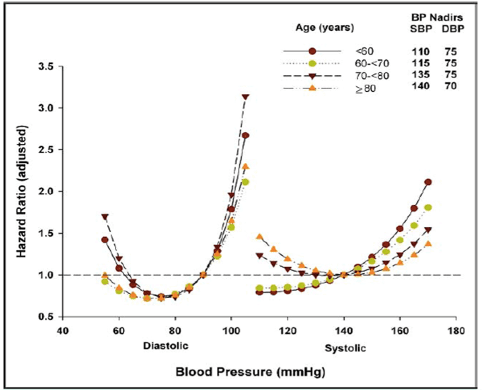
There is a lot of information on blood pressure because so many studies have been done over many decades. I’m going to share one interesting study, the INVEST study, with over 22,000 people because they separated people by age groups.[6] The “J” curve in this is obvious in all age groups, but different age groups have different optimal blood pressures.
Diastolic blood pressure does not change – the optimum remains at 75 mmHg. The ideal diastolic blood pressure stays within a narrow range. Systolic blood pressure, however, increases over a few decades of life from an optimal of 110 mmHg for those less than 60 years old, to 140 for those over 80. Moreover, older people don’t want their systolic blood pressure to be lower than 140 because their death rate goes up. For a person over 80 years old, a systolic blood pressure of 120 is a higher risk than a blood pressure of 150.
Another very interesting thing to note is that when the blood pressure is optimal, the risk of dying is less than one. In other words, an optimal blood pressure will prolong your life. Notice that nothing else we have seen actually increases life span (where the “Mortality Ratio” is less than “1.0”).
Homocysteine
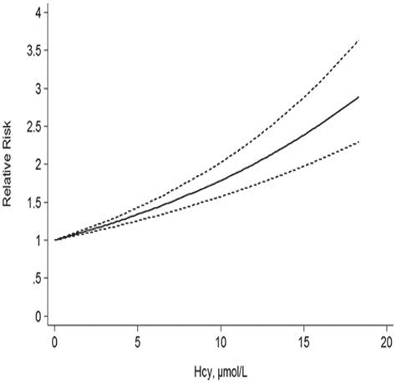
Not everything has a “J”curve. Some things are not needed by the body. For example, the waste product homocysteine is often measured as a marker for methylation, or the function of the B-vitamins: B12, B6, and B9 (folic acid). In this case, the lower the better.[7]
“Hcy” is homocysteine. “Relative Risk” is relative risk of death. “1” is the average risk of dying and “2” is twice the average risk of dying. Clearly, in the case of homocysteine, there is no “optimal” amount – less is better.
Vitamin B6 (Pyridoxine)
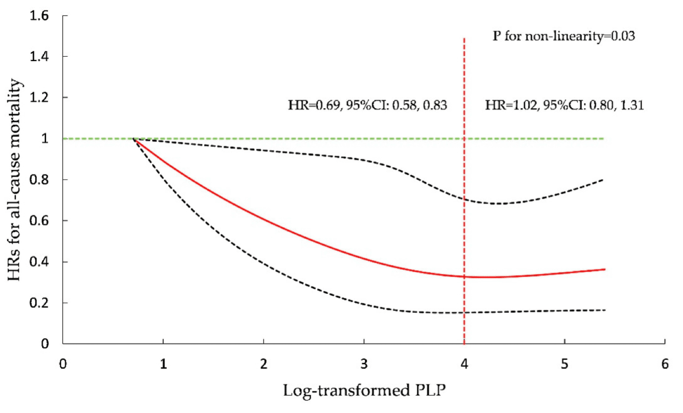
Another vitamin supplement that may actually lower death rate is vitamin B6. Pyridoxine is essential for so many functions in the body.[8]
“PLP” means “Pyridoxal-5-Phosphate.” The optimal level is 4, making the death rate significantly lower than “1.” Notice that a blood level higher than 4 shows a slight increase in death rate.
Exercise
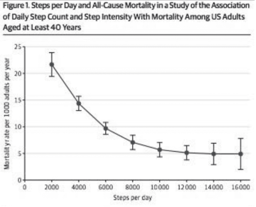
Let’s look at the effect of exercise on mortality.[9]
This is a different ‘J’ curve that only has the downside for those taking fewer steps. The benefit of exercise levels out after about 12,000 steps. Those who take half as many steps have about twice the risk of dying. I include this to illustrate that sometimes “All-cause Mortality” can be deceptive. Those who are sick are going to take fewer steps because of disability. Those who are healthy and strong are going to take more steps. So, this is one of those “of course!” graphs. Nothing to see here! Except, consider that if you want to be healthy and vigorous and lower your death rate it is still a good Idea to remain active.
Recommendations for Optimal Health
The take-away message is that there is an optimal amount of everything. Don’t do too little, and don’t do too much! How do you know? Let’s look at some simple guidelines:
- Eat moderate amounts of Calories from carbohydrates, fats, and protein. (and fast periodically)
- Take vitamins every week. Think about it: a person can get a few milligrams of vitamin B3 from food on a daily basis, and the supplement is a hundred times that. Most nutrients are similar. Taking the supplements on a weekly basis allows your nutrients from food to be absorbed, and the huge amounts in the pills can “fill up the tank” on a weekly basis so you keep an optimal level.
- Exercise regularly, doing more than average. Instead of 6,000 steps, take 10,000 to 12,000.
- Keep your DIASTOLIC (the lower number) blood pressure around 75 by exercising and lowering stress. Stress is significantly related to elevated diastolic blood pressure.
- Keep your blood sugar around 100, or HbA1c between 5.0 and 5.4.
- Get homocysteine down as low as possible.
If you have questions about a specific blood test or supplement, look up the mortality rates associated with it. You may be surprised to find that it is different than the conventional wisdom dictates. Instead of looking for “normal” or “average” or “expected range,” look for what is optimal. I hope this gives you an understanding of how to interpret your findings to discover what is optimal.


